
In the digital age, your website plays a crucial role in your restaurant’s marketing.
It’s the first place your guests go to for important information. Like your location, phone number, menu, reservations, and online ordering.
As a former restaurant operator, I know how excited we are to showcase everything we have to offer. Let me tell you - this never ends well. We end up cluttering our website with too much information that overwhelms visitors.
In this guide, you’ll learn how to declutter your website the KonMari way.
You can pass this guide to your web developer or remove stuff yourself.
- What is the KonMari Method™ and how you can apply it to your website
- Flash Player
- Fancy fonts and animations
- PDF menus
- Instagram feed
- Reviews
What is the KonMari Method™ and how you can apply it to your website
The KonMari Method™ is the art of tidying, created by Marie Kondo. She is a Japanese organising consultant, author, and TV presenter.
The idea is to discard “quickly and completely” whatever is in the house that does not ‘spark joy’.
We’ll apply the same principle to improving your website’s usability. What we want is to make it easy for your visitors to access information, load fast, and create a good impression.
Here are 5 things your website doesn’t need in 2023:
Trash your Flash Player
Awhile back, Flash Player was trendy, but nowadays it’s a complicating nuisance. Here’s why:
- ❌ You need to hire a Flash designer every time you want to update your menu, or promote an event on your website
- ❌ Search engines cannot read the text on a Flash site
- ❌ Mobile devices cannot display Flash content
- ❌ Google sees your website as a blank page
- ❌ You'll rank lower on search results
It’s time to trash the Flash and simplify your website.
✅ If you plan to overhaul your old website, consider using a modern-day website builder. They are easy to update, and display well on any device.
Ditch the fancy fonts and animations
❌ Restaurant websites sometimes get carried away with fancy fonts and animations. Edgy fonts can make the site difficult to read. Over-enthusiastic animations slow the loading time.
All this detracts from the website’s true purpose: to show off your amazing food and service.
KonMari your restaurant website by ditching the designer fonts and overwhelming animations. When it comes to user experience, less is more!
✅ Opt for classic, comfortable fonts1 that all customers can read. Keep it simple with subtle animations or none at all.
This will allow the customer to focus on the real content of your restaurant website.
Purge the PDF menus
Here are two things that p*ss me off about PDF menus:
- ❌ the file is so large, it takes forever to load
- ❌ your guest needs to download and save the file to view your menu
The worst ones are where you scan a QR code, only to take you to a PDF file!! Or the ones that open up in Google Drive. What if your guest doesn’t have a Google account??
PDF menus are difficult to read on mobile phones. Most people may not even have the right software on their devices to open them up.
As with Flash Player, PDF menus pose similar problems:
- ❌ PDFs do not display well on mobile devices
- ❌ Large and heavy files lead to poor SEO results
- ❌ You cannot update PDFs in a quick and painless way
✅ Instead of Flash or PDF, use HTML2 to showcase the best items in your menu, like these examples:
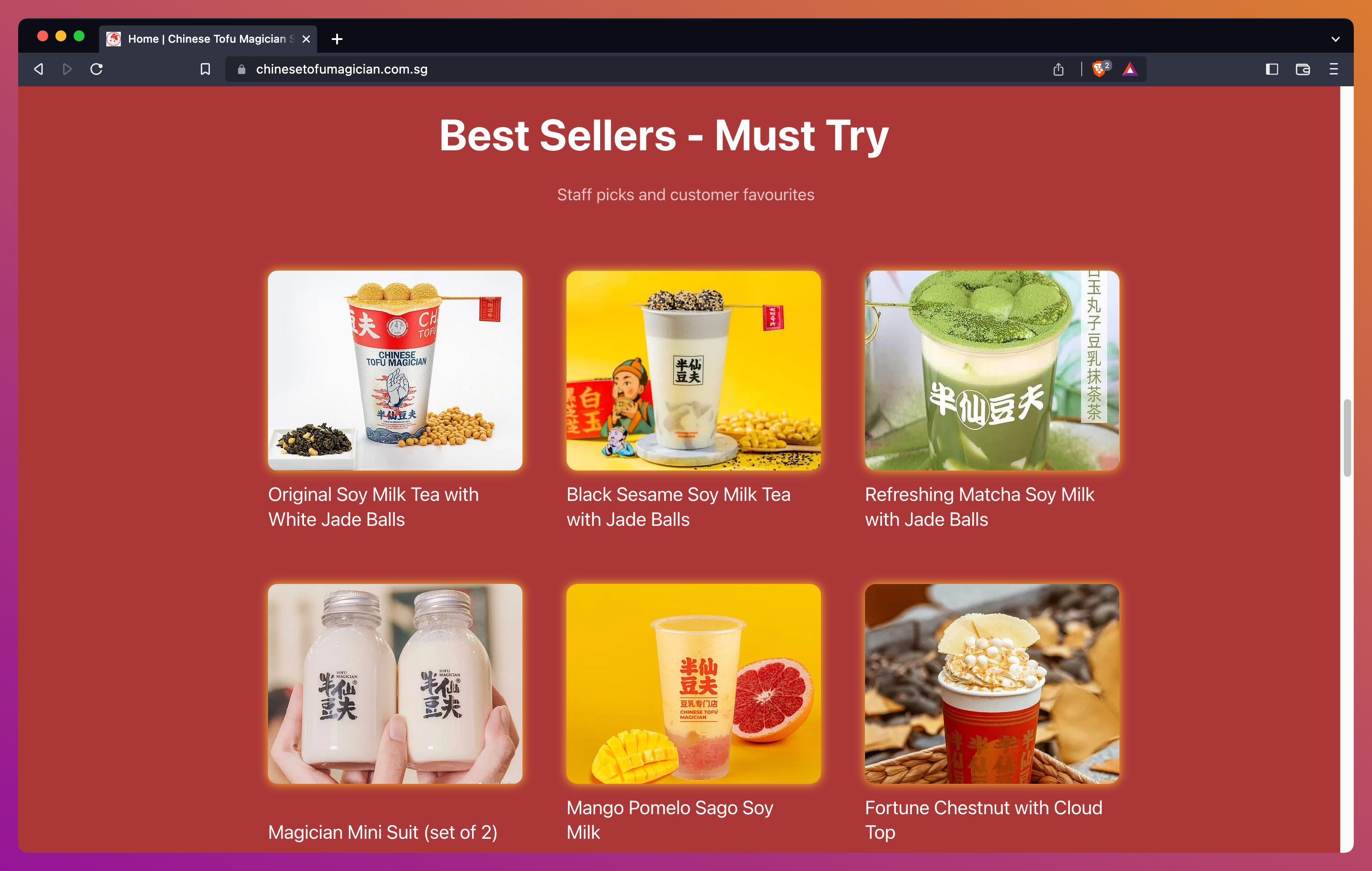
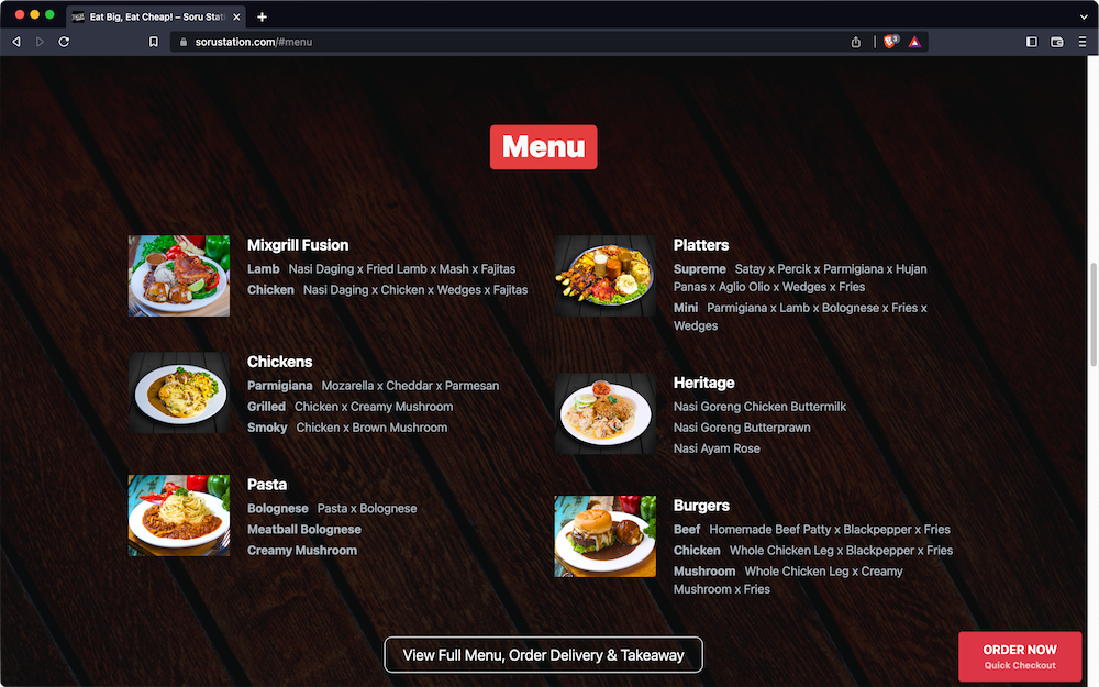
You can then put a link or button below the section, that says ‘View Full Menu’.
This should link to your QR menu or online ordering menu. These are easy to update, and display well on any device.
You also save money by not having to pay a designer every time you want to update your weekend special.
Scrap the Instagram feed
You should use Instagram to drive people to your website. Not the other way around.
Let me say that again, louder, for the people at the back:
You should use Instagram to drive people to your website. Not the other way around.
❌ Having an embedded Instagram feed on your website makes it look congested.
Keep it slick.
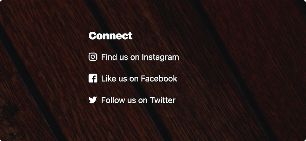
✅ Create a section at the bottom or side of your website, with icons that link to your social media pages.
That’s all you need to let visitors know how to connect with you on socials.
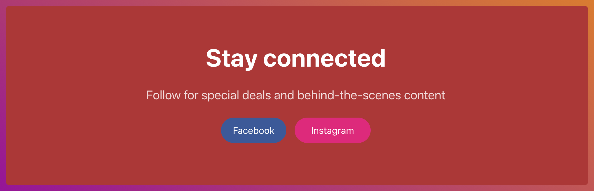
The Instagram feed is not something that compels people to take action. So, get rid of it.
If your customers want to see your latest Instagram posts, they’ll know to go to your Instagram page to find them.
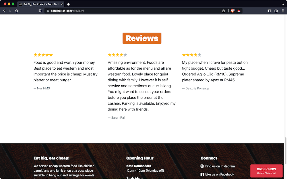
Remove reviews
Likewise, if guests want to see reviews, they know how to use Google.
We’re talking about embedded reviews. The ones that pull in reviews from Google, TripAdvisor, Yelp, TrustPilot, etc.
❌ You have no control over them and sometimes they include negative reviews.
Be honest with yourself - Do these automated reviews add any value to your website?
You shouldn’t have anything negative said about you on your own turf.
✅ If you must have a Reviews section, hand-pick a few testimonials that tell your story in a positive light.
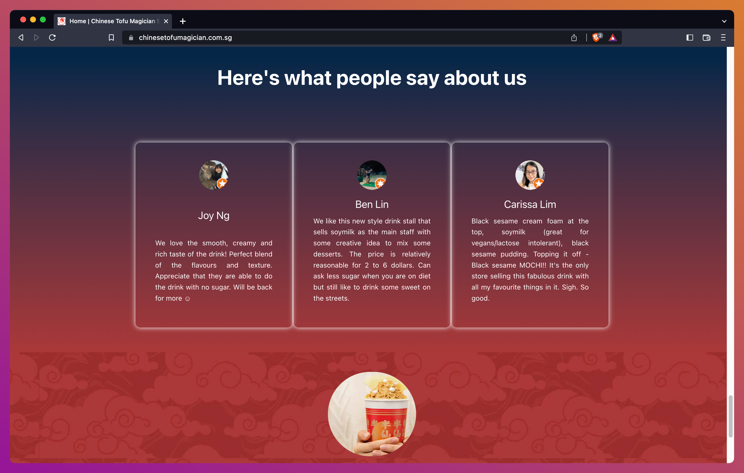
Consider using tools like Testimonial and RateMe:
Testimonial lets you collect, manage, and embed reviews in an easy way. It includes video testimonials, too, adding something different and exciting to your website. This way you can feature only the best reviews on your website.
RateMe helps you get good reviews on public sites like Google, Facebook, Yelp etc. It is a safe portal to ask for reviews, following the good ol’ principles:
- Not happy? Let US know (send feedback to your restaurant privately)
- Happy? Let EVERYONE know (publish the review publicly)
This way you’ll have full control over the reviews you want to show on your website.
Conclusion
Make room for an intentional and effective website. Same as you would with your living space or restaurant kitchen.
😌 Clear out the unnecessary.
✨ Keep only things that spark joy.
---
We use the term 'restaurant' throughout the article for consistency. However this guide to deluttering your website can be generally applied to any type of food shop, including but not limited to: bakeries, bars, bistrots, boulangeries, butcheries, cafés, caterers, coffeeshops, delis, diners, eateries, food trucks, patisseries, pubs, etc.